Black‑and‑white design has survived every trend cycle for a reason: it’s bold without being brash, timeless yet endlessly adaptable. When the two colors meet on a roll of wallpaper, they can transform walls into instant focal points—no expensive art needed. Below are field‑tested tips for weaving monochrome patterns into living rooms, bedrooms, and even kitchens while avoiding the pitfalls of stark contrast overload.
1. The Power of Contrast is Real!
Black anchors a space, adding visual weight and definition, while white opens it up, bouncing light and softening edges. A high‑contrast pattern—say, graphic chevrons—will feel energetic and modern, perfect for an entryway that needs a jolt of personality. Lower‑contrast motifs like soft charcoal florals on ivory ground read gentler and suit rooms where you’d rather exhale than grab your keys and dash.
2. You Should Start With One Dominant Hue
Before committing, decide which color drives the narrative. A white‑dominated print with fine black detailing keeps things airy; ideal for small apartments hungry for light. In a loft with ample sunshine, flip the ratio: large black fields with crisp white accents create cinematic drama that won’t overwhelm.
3. Choose Patterns That Match the Room’s Function
• Geometric grids sharpen home offices by implying order and precision.
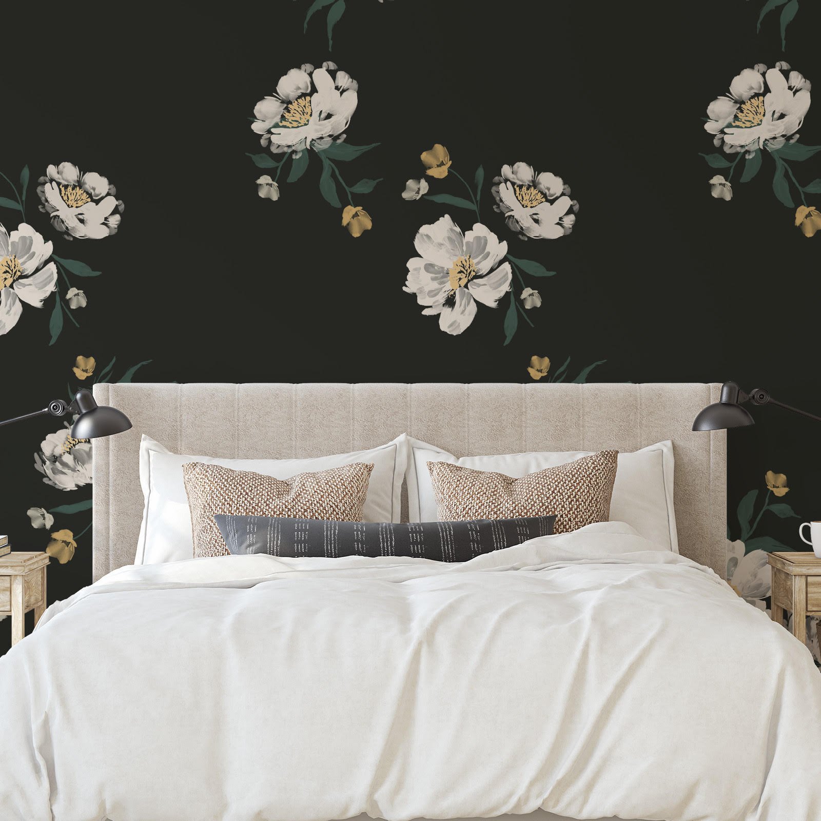
• Hand‑drawn botanicals lend bedrooms a restful vibe, softening the binary palette through organic shapes.
• Stripes stretch or shrink perceived dimensions. Vertical stripes raise ceilings; horizontal widen corridors. Just watch scale—thin pinstripes feel dress‑shirt tailored, wide bands feel beach cabana.
4. Add a Controlled Color Pop
Monochrome doesn’t have to mean colorless. Inject a single, deliberate accent—cobalt lamp bases, ochre velvet cushions, or even a section of blue wallpaper inside built‑in shelves. The surrounding black and white will amplify that hue, making a small dose feel generous.
5. Pair with Complementary Materials
Matte finishes—powder‑coated metal, chalky ceramics—temper the shiny surface of many vinyl papers. Meanwhile, warm woods prevent a black‑and‑white scheme from feeling clinical. Walnut sideboards or rattan pendants add a hit of nature that grounds the high‑contrast energy.
6. Zone Open‑Plan Spaces
In open lofts, different wallpaper panels can carve out zones without erecting walls. A bold herringbone wallpaper black white could define the dining nook, while the adjacent lounge wears a subtler speckled dot pattern. Keep floors and large furniture pieces neutral so the patterns do the talking without shouting over each other.
7. Mind the Lighting!
LED bulbs with a warm (2700K–3000K) temperature soften harsh contrasts and prevent black areas from reading flat. Natural daylight will increase drama during peak hours; consider dimmers for evening mood shifts.
8. Think Beyond the Wall
Leftover wallpaper scraps transform drawer fronts, stair risers, or lamp shades into custom accents that echo the main feature wall. In rental spaces, frame large wallpaper panels like artwork—no security‑deposit drama when it’s time to move.
9. Prep and Installation Essentials
Measure twice, order once—and always grab an extra roll for pattern repeats and future touch‑ups. Smooth, primed walls are non‑negotiable; black emphasizes surface flaws far more than pastels do. If you’re DIY‑inclined, peel‑and‑stick options let you reposition until seams vanish; just squeegee from the center outward to chase air bubbles away.
10. Live with It, Then Layer
Install the wallpaper, leave the room mostly bare for 24 hours, and observe how light, shadow, and movement interact with the pattern. Only after that “getting‑to‑know‑you” phase should rugs, art, and accessories join the party. This sequence prevents over‑decorating and ensures the wallpaper remains the headliner, not just another design element fighting for attention.
Black‑and‑white wallpaper is the design equivalent of a perfectly tailored suit: crisp, confident, and adaptable to countless occasions. Whether you opt for delicate botanicals or bold, gallery‑worthy geometrics, mastering contrast and balance will guarantee interiors that feel both daring and refined—proof that two colors, thoughtfully applied, can deliver a spectrum of style.